pl
- en
- pl


-mobile.jpg)
-desktop.jpg)


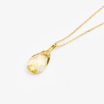
.jpg)
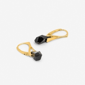
.jpg)


- Nowości
- Bestsellery
- Złoto


Twoje korzyści
zobacz, co zyskujesz